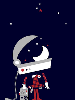
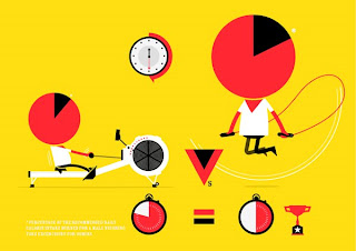
 I've produced an image for the 2011 - 100yrs of Macmillan calendar. They've used it on the cover as well. It's for a great cause and you can find out more info and purchase one here.
Friday, 17 December 2010
100 Years of Macmillan
 I've produced an image for the 2011 - 100yrs of Macmillan calendar. They've used it on the cover as well. It's for a great cause and you can find out more info and purchase one here.
Thursday, 11 November 2010
Friday, 29 October 2010
Tuesday, 19 October 2010
Friday, 15 October 2010
Thursday, 14 October 2010
Tuesday, 12 October 2010
Wednesday, 6 October 2010
Tuesday, 5 October 2010
Monday, 27 September 2010
NEW SKETCHBOOK
Friday, 24 September 2010
Tuesday, 21 September 2010
WHAT'S THE TIME?
Tuesday, 31 August 2010
ACCORDIAN
Monday, 23 August 2010
YATCHSHOUND
Tuesday, 17 August 2010
Monday, 9 August 2010
Monday, 12 July 2010
ENGLAND / AUSTRALIA
Tuesday, 25 May 2010
Tuesday, 27 April 2010
PiCK ME UP (SOME MORE) @ SOMERSET HOUSE
Tuesday, 20 April 2010
PICK ME UP @ SOMERSET HOUSE
 Together with the Peepshow family, I'll be down at 'Pick Me Up' at Somerset House from this Thursday, you can see what we've been up to over at the blog. Should be interesting and a great way to get some lovely affordable contemporary art. Here you can see one of mine straight out of the sketchbook.
Wednesday, 31 March 2010
Tuesday, 16 March 2010
HONDA DREAM MAGAZINE - working method

I've decided to show how I resolve a brief and have chosen a recent commission from Honda Dream Magazine. Having rec'd the initial brief from Jamie Marsden and his initial scamp (above) my task was to create a character to illustrate electricity and another to show petrol and how they work together. My job involved illustrating a series of explanatory paragraphs over 2 double page spreads and a main holding image as an introduction.
HONDA continued
 3) Initial sketchbook work, working out the electric and petrol characters.
4) Working them up into vectors, I liked the size difference between the large petrol man, big and strong holding up the placeholder engine and the petite electric lady simply switching on the electricity.

5) Client doesn't want to show a large petrol character, wanting them both the same size as to show no bias between the 2 technologies, I also had to drop the engine and go back to a petrol pump hose typography style.

5) Client doesn't want to show a large petrol character, wanting them both the same size as to show no bias between the 2 technologies, I also had to drop the engine and go back to a petrol pump hose typography style.
6) Introduction of battery icon and refinement of type with the two characters in harmony smiling at each other plus a pigeon.
 7) Car reference
 7) Car reference
8) First DPS, using the language of the in car display. Following the copy and direction of the client, each point is explained with the arrow joining the illustration together.
9) Continued working drawing. I like to work on the PDF layout sent by the client and fit the illustration in the space.
10) Client feedback scan, marked with comments.
 11) Taking on board the comments, introducing a stop sign and arcing the journey back round.
 11) Taking on board the comments, introducing a stop sign and arcing the journey back round.
12) Continued working drawing sent to client.
13) Detail sent to client with revised 14) showing the electric lady recharging with a power juice.
15) Final image sent for final approval. Small amendments made to this included changing the colour of the ladies face to differentiate here form the petrol man and altering the badges on there lab coats. I prefer the characters both having red faces as seen here.
Monday, 1 February 2010
Friday, 22 January 2010
POSITIVE
Subscribe to:
Comments (Atom)


